Overview
A site for a fictional Fintech app. It has a landing page with key information about the company and app, as well as a blog about finance. The site was built with Next.js, using TailwindCSS for styling and Framer Motion for motion graphics.
Screenshots
Home page
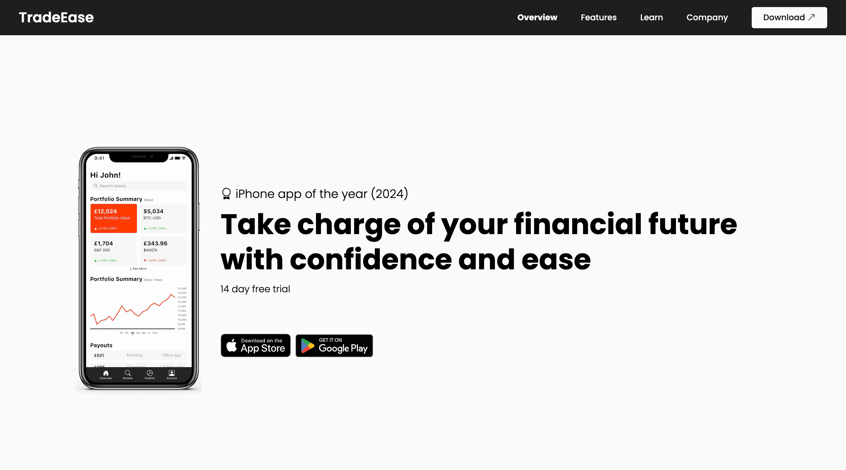
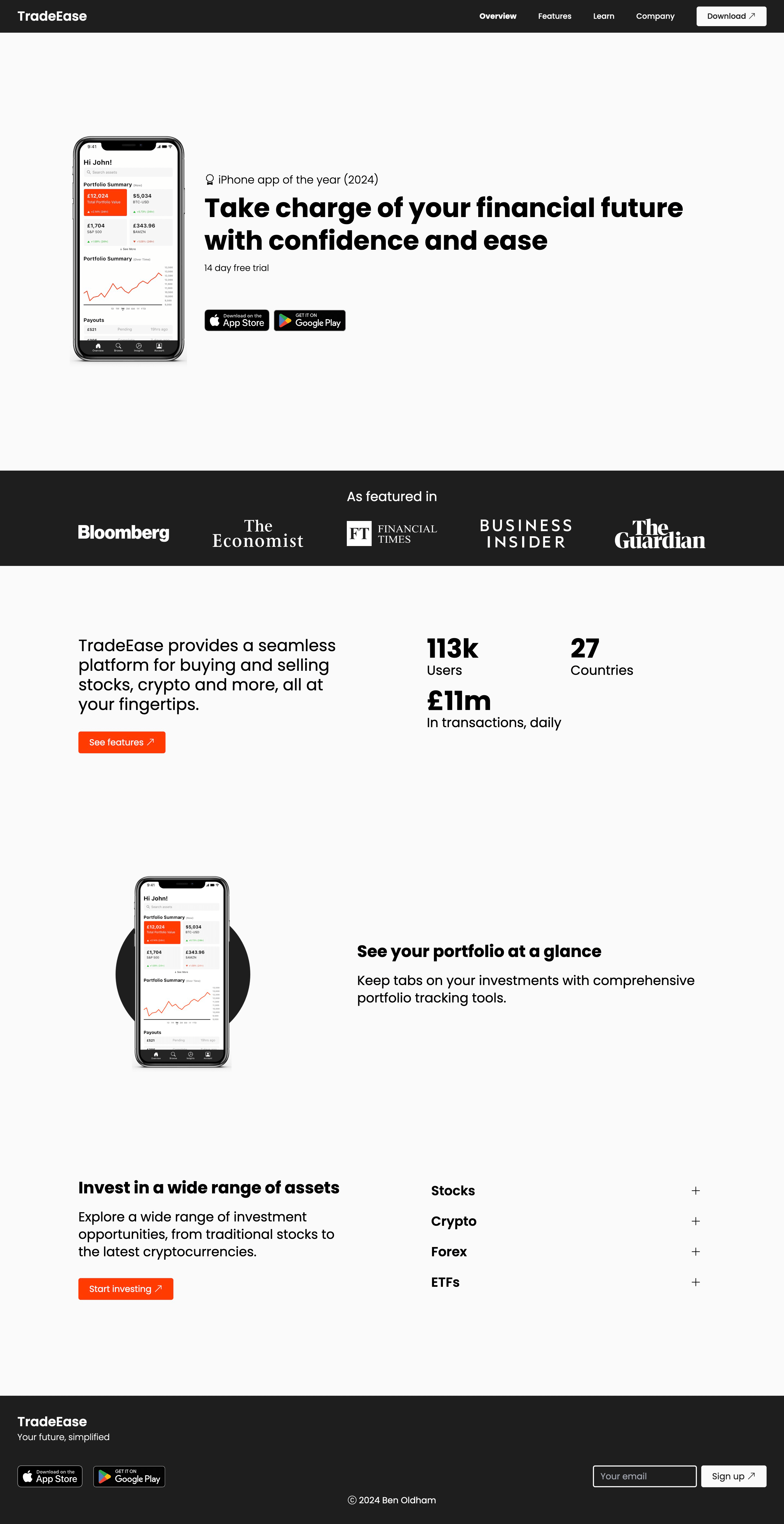
A landing page with a hero section showing a screenshot of the mobile app and CTA to download. Social proof is demonstrated with a row of ‘featured in…’ logos and mentions of an award. The page also shows some key stats and features of the app that may interest potential users.
Features page
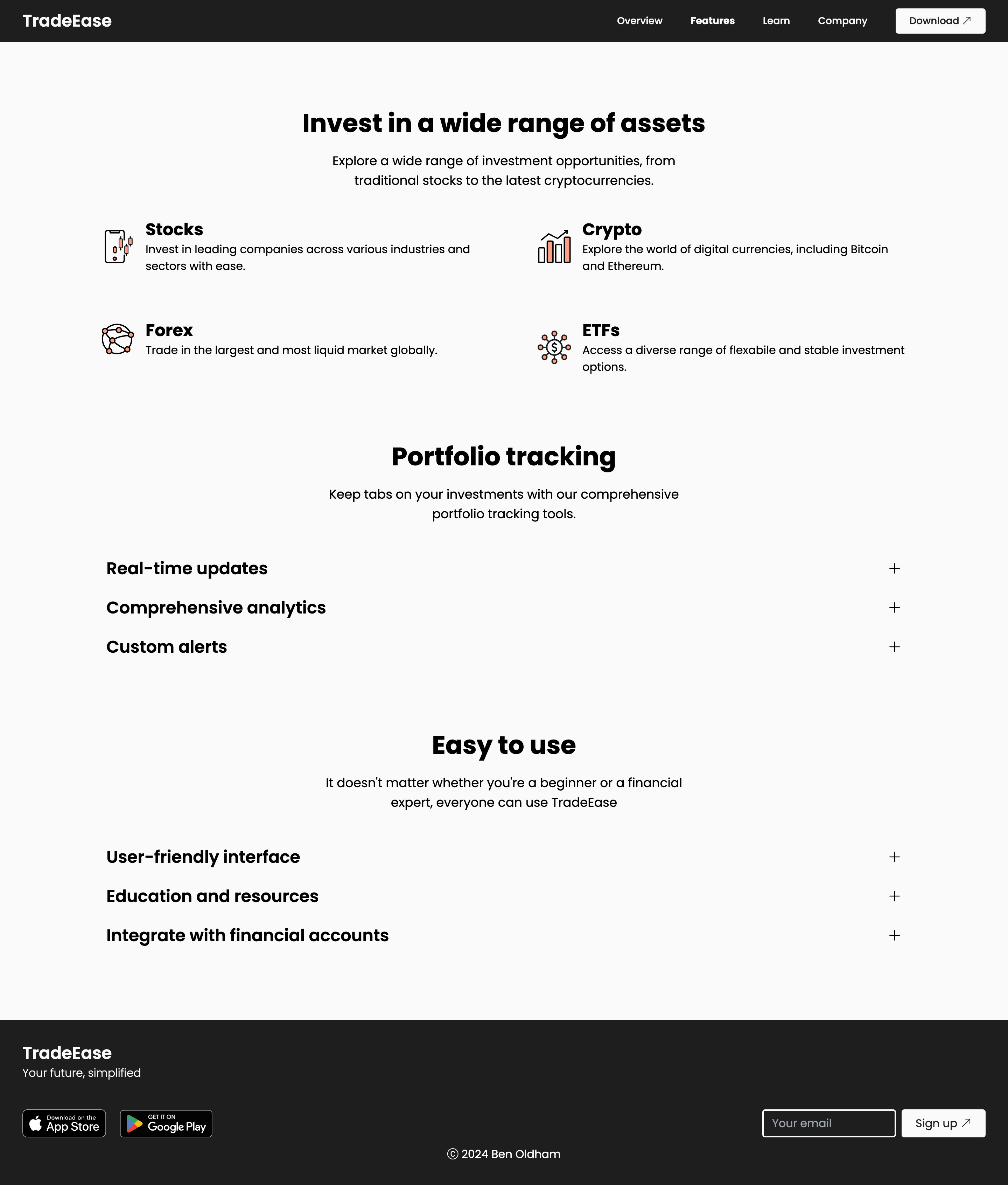
Elaborates further on the features within the app, such as which assets can be invested in.
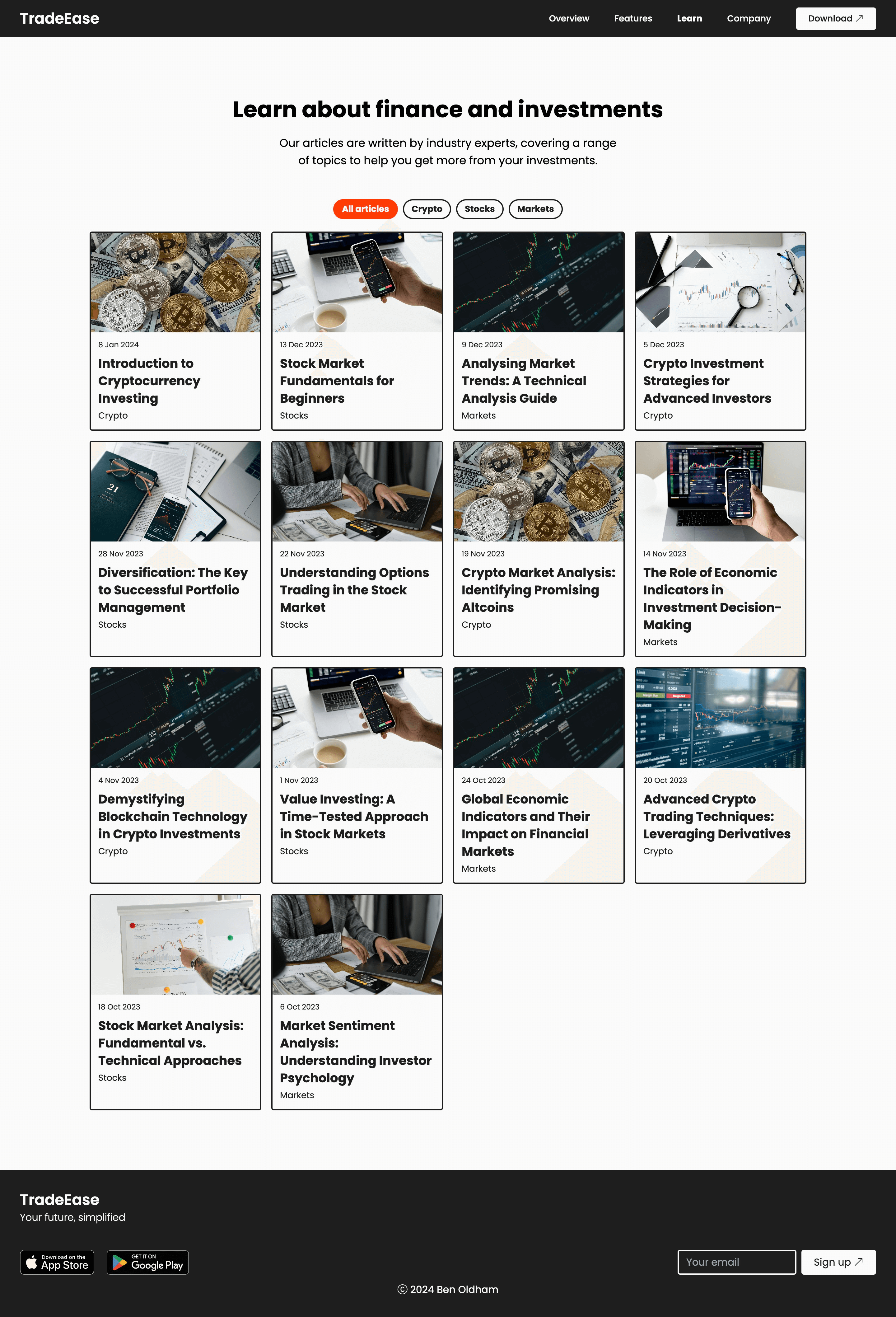
Learn page (blog)
A blog for various topics about finance. This is good for SEO and would help drive traffic to the site, as well as helping users learn more about finance to optimise their investments.
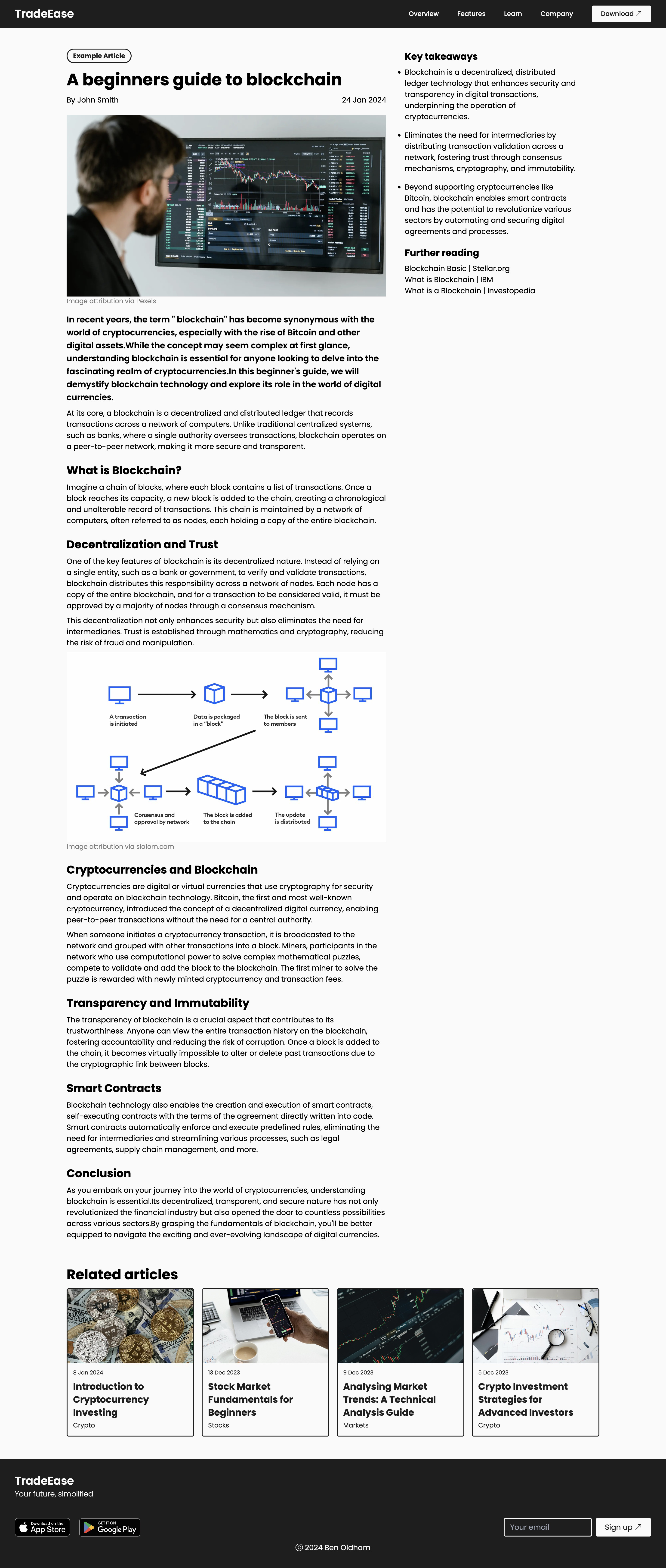
Sample article
I’ve included a sample article page, showing how the blog article content would appear. In a production system, I would likely load the content from a remote or local CMS, but I felt that was out of scope for this project.
Company page
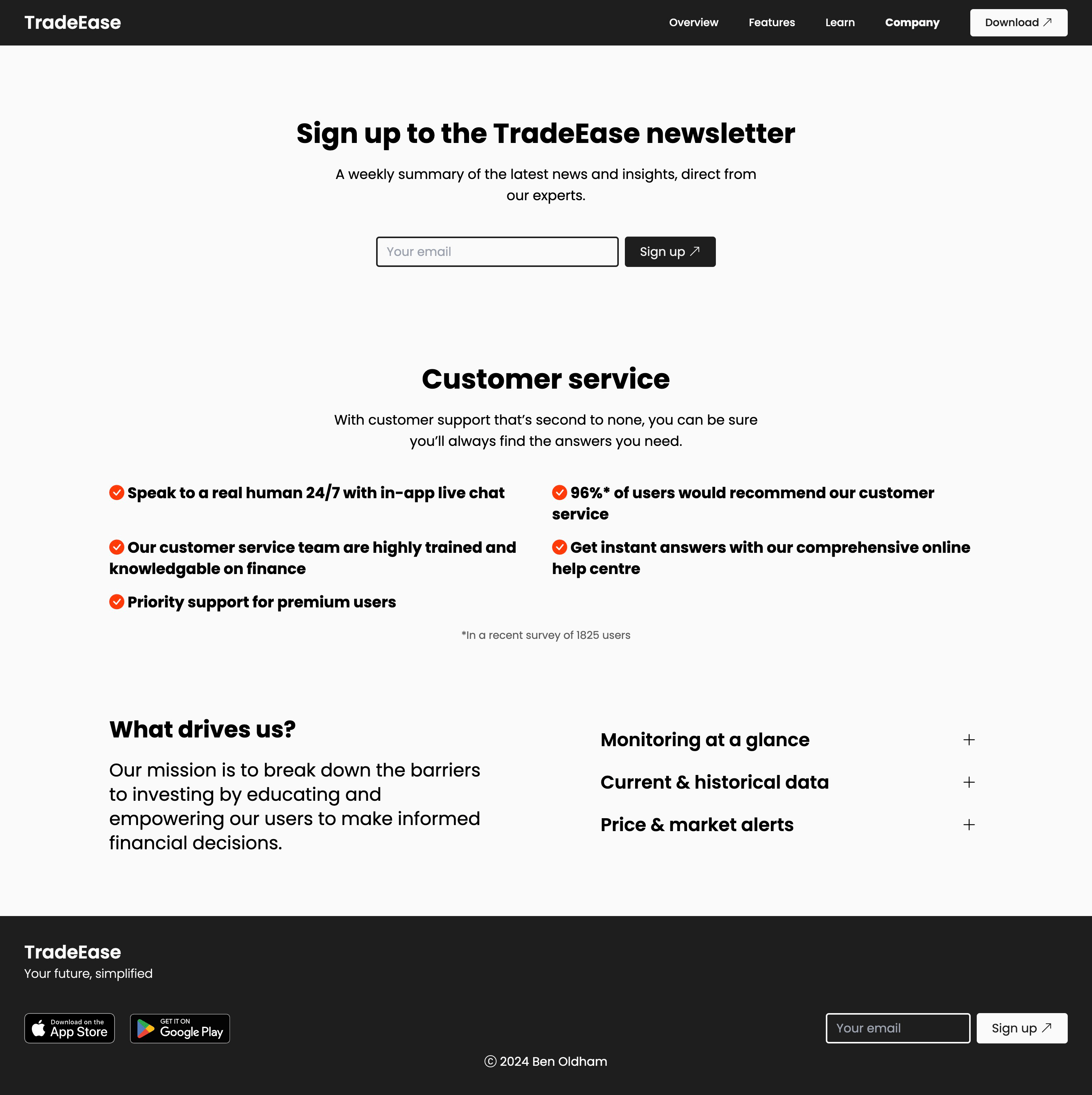
Displaying information about the company, including customer service. There is also a form to collect email addresses for a weekly newsletter.
