Overview
In preparation for a company-wide relaunch later that year, I was hired at FixMyTek to redesign their website. This was not just a visual refresh, as we discussed the wider goals of increasing web leads and online device sales - to consider how this could be achieved through design.
Before

After

Before
Home page
The old home page was visually boring, lacked clear branding (e.g. inconsistent colours) and was badly optimised for mobile responsiveness.
Overall, the design lacked cohesion, with inconsistent use of colours, spacing and graphic elements.
Despite the visual flaws, the structure of the page was reasonably good - with a clear CTA and value proposition included prominently on the hero section. Reviews were also displayed for social proof, as well as the logos for their partner institutions.

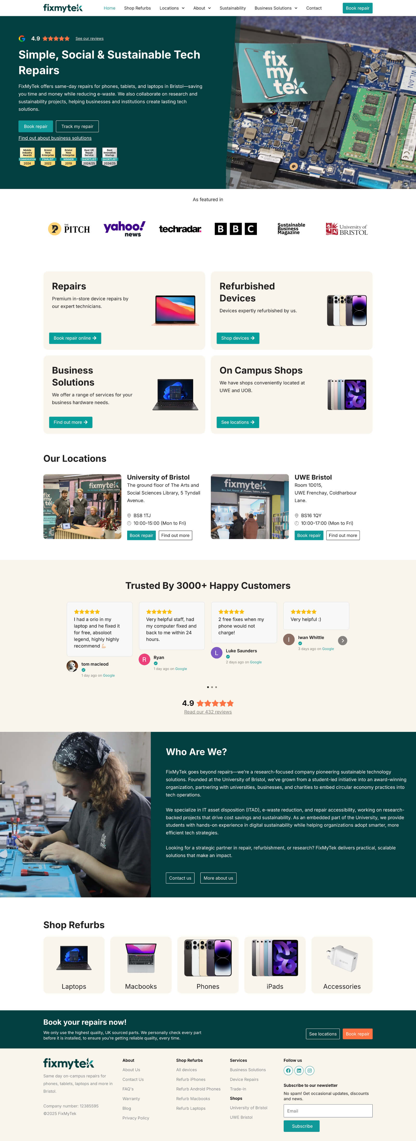
After
Home page
My redesign incorporates a more interesting hero section, with the brand colours displayed consistently. I also introduced a more versatile
design schema that could be used throughout the site, incorporating elements such as cards to display information and help users navigate
smoothly.
